Video #5354 · Split screen
Sales page design critique and fixfrom @pixeldesignlab
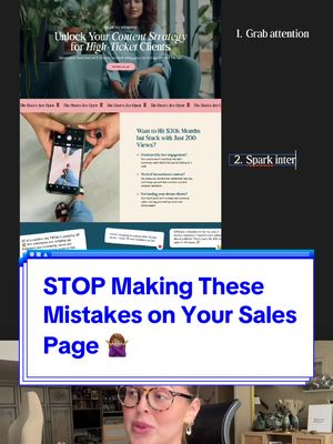
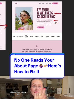
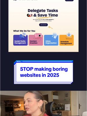
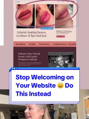
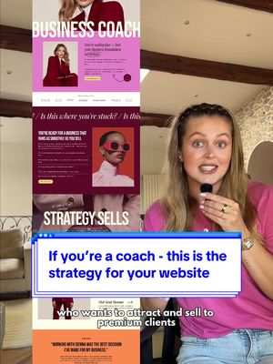
The creator critiques a poorly designed sales page, highlighting its flaws like unclear messaging and bad layout. She then demonstrates a complete redesign, explaining how to create a more effective page by using clear language, aligning with social media, and building trust. She concludes by outlining a four-step framework for guiding users to purchase: grab attention, spark interest, create desire, and remove doubt.
- 1Showcase a flawed example
- 2Diagnose the core problems
- 3Reveal the superior alternative
- 4Explain the improvement principles
- 5Summarize into a simple formula
ConceptsGood vs BadBreakdown
ElementsScreen RecordingPicture-in-PictureText OverlaySocial Proof Screenshot
[05]
Hook analysis
What stops the scroll in the first 3 seconds
Title hook · 45%
STOP Making These Mistakes On Your Sales Page 👉 Do This Instead
Verbal hook · 35%
This is how your sales pitch should never look like.
Visual hook · 20%
A split-screen view showing a speaker in the bottom half and a screen recording of a poorly designed website labeled 'BEFORE' in the top half, immediately establishing a problem/solution dynamic.
[06]
Hook template
Steal this for your own video
STOP Making These Mistakes On Your [thing you're improving] 👉 Do This Instead
- — STOP Making These Mistakes On Your Sales Page 👉 Do This Instead
- — STOP Making These Mistakes On Your Workout Plan 👉 Do This Instead
- — STOP Making These Mistakes On Your Resume 👉 Do This Instead
[07]
Hook and payoff
The promise the opener makes, and how the video pays it back
Hook
A bold, negative declaration that establishes a common practice as incorrect, creating an immediate knowledge gap and positioning the creator as an authority.
Payoff
A final statement that explains the ultimate purpose and benefit of applying the new formula, providing a satisfying resolution and empowering the viewer.
[08]
Narrative framework
The structural pattern this video runs on
Framework
The Expert Redesign
A 'Before vs. After' transformation that critiques a common mistake, then provides a principle-based solution and a memorable, actionable framework.
- 1
The Flaw Diagnosis
Rapidly identify and list the specific, observable errors in the 'bad' example to agitate the viewer's pain points and establish the problem's validity.
- 2
The Strategic Goalpost
State the high-level objective or desired outcome that the flawed example fails to achieve, setting the standard for the solution.
- 3
The 'Instead' Pivot
A clear verbal and visual transition that signals the shift from problem to solution, building anticipation for the reveal.
- 4
The Principle-Based Reveal
Introduce the 'good' example piece by piece, with each element justified by a core principle or rule, teaching the 'why' behind the 'what'.
- 5
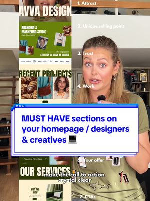
The Actionable Formula
Distill the entire improvement process into a simple, numbered list of steps that the viewer can easily remember and apply.
Themes
- Education
- Expertise
- Problem-solving
- Business Growth
Techniques
- Before and After
- Critique and Redesign
- Framework Explanation
Post caption
These are the mistakes I see almost on every sales page, not just on this one example I recently saw at @Courtney l Business coach📱. Your site and brand has so much potential and I just think it can be done better & make more money 😁 #redesign #uxdesigner #salespage #uxdesign #webdesigner #webdesign #designer #website #websitedesign #businesswebsite #uxdesigntips
Text overlays
Transcript
This is how your sales pitch should never look like. Welcome to my side. Very unclear messaging, stretched image, messy layout. You need to understand that you need to attract visually in the first second and explain how your worse mastermind service is gonna change the life of your potential client. So here's what you can do instead. Use simple, straightforward language so I know exactly what you're talking about even without thinking. Your sales page needs to align with your content on socials. So when people land on your site better interacting with your videos, the experience is the same. And this consistency in branding strengthens loyalty and builds trust. Your sales page needs to guide users to buy. So grab attention, spark interest by addressing pain points, create desire with benefits and social proof. Remove doubt with your solutions and testimonials, and repeat clear call to action button throughout the page on multiple places to drive users to sign up or buy.