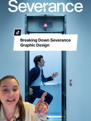
The creator, a graphic designer, breaks down the symbolic use of graphic design in the TV show "Severance." She analyzes the typography, comparing it to corporate and Apple branding, examines the propaganda-style posters, points out the generic branding of in-world products, and discusses the anachronistic set design, concluding that these elements intentionally create a disorienting, timeless world for the viewer.
Post caption
Did you notice these design elements in Severance?? 👀 Anna, one of our graphic designers, breaks down the symbolism behind it all 📝 #marketingagency #marketing #graphicdesign #severance #severancetheories #graphicdesigner
Transcript
Haven't seen anyone talk about this, but Severance uses graphic design to not only mess with its characters, but with us too. Let's talk about some design elements that you might have missed. Take the typography. Lumen's office documents use a friendly best controlled sans serif, kind of like the ones that corporations use to seem more human better still have total control. This modern typeface contradicts the retro vibe of the set design. Even more ironic, the title sequence uses Apple's exact font. Coincidence? War War one propaganda posters like these ones. I found some examples. So the Lumen posters are on top, propaganda is on the bottom. Pause to read. The design of these posters make Lumen seem more like a regime than a workplace. Even the smallest details add to this warped reality. Tier new machine snacks have no real or fake brands, just generic corporate food designed only for employees. Then there's the set design. The office looks straight out of the nineteen fifties. The cars are from the seventies and eighties, and the computers are ancient. But then, boom, Mark pulls out a smartphone. It makes no sense, but that's on purpose. In mashing together different time periods, severance makes time feel meaningless. It all adds up to a world where nothing feels quite right. That's exactly the point.