@shwinnabego
TikTok · Greenscreen Talking Head
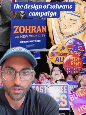
@shwinnabego The design of zohrans campaign - 11/10 work #design #nyc

@shwinnabego
TikTok · Greenscreen Talking Head
@shwinnabego The design of zohrans campaign - 11/10 work #design #nyc
Performance
Video #5794 · Greenscreen Talking Head
[01]
The creator provides a detailed graphic design analysis of Zohran Mamdani's NYC political campaign. He breaks down the campaign's visual identity, including its vibrant colors, humanist typography, and clear messaging, and reveals its design inspirations from NYC iconography and vintage Bollywood. The creator contrasts this effective branding with the generic designs of political opponents and highlights the campaign's hyper-local approach for each borough, ultimately praising its exceptional execution.
[02]
[03]
 538.7K8.7×Breaking down campaign graphic design@shwinnabegobrand · Breakdown
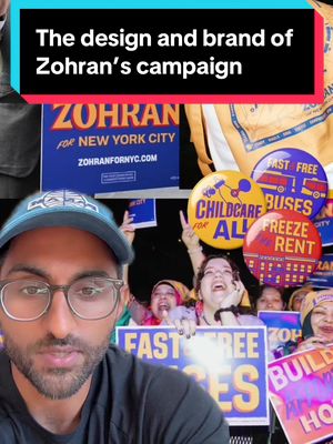 1.1M19.3×Political campaign design breakdown@shwinnabego · Case Study Breakdown
 732.6K2.8×Critiquing overstimulating news graphics montage@ryanselvy · Case Study Breakdown
 65.6K2.3×Hairstylist branding case study.@pixeldesignlab · Hypothetical Case Study
 289.2K6.5×Creator analyzes TV show design elements@staffroomtalks · Breakdown
 1.2M14.7×Argument that simple defined shapes make for better design@hansloreidesign · Breakdown
 280.9K1.1×Analyzing government's new tech aesthetic@ryanselvy · Breakdown
 1.7M32.8×Creator applies to design artist's merch@kweinbydesign · Hypothetical Case Study
 2.1M5.3×Designer shows creative process for team@kweinbydesign · Behind The Scenes
 54K1.1×Explaining a website design transformation@pixeldesignlab · Before/After Transformation
 121.4K22.8×Explains creative technique with examples@jason_swet · Case Study Breakdown
 242.1K39.9×Breakdown of award winning campaign@brotsalz · Case Study Breakdown
[04]
[05]
What stops the scroll in the first 3 seconds
Title hook · 45%
The design of zohrans campaign
Verbal hook · 45%
The graphic design of the Zoran campaign must be studied, so let's study it.
Visual hook · 10%
A dynamic collage of campaign materials, including photos of the candidate, lawn signs, branded apparel, and supporters, creating immediate visual density and context.
[06]
Steal this for your own video
The of deserves to be studied.
[07]
The promise the opener makes, and how the video pays it back
Hook
The Authoritative Mandate: A declarative statement that frames the subject as a crucial case study ('must be studied'), positioning the creator as an expert guide and compelling the viewer to pay attention.
Payoff
The Definitive Verdict: A conclusive, often numerical or superlative, judgment ('12 out of 10') that summarizes the entire analysis and provides a satisfying, memorable takeaway, reinforcing the initial thesis.
[08]
The structural pattern this video runs on
Framework
The Expert Deconstruction
To establish authority on a subject by presenting a compelling, evidence-based analysis that breaks down why a specific example is exceptional, often contrasting it with inferior alternatives to amplify its strengths.
The Principles of Excellence
Establishes the objective criteria for what constitutes 'good' in this category (e.g., 'flexible,' 'instantly recognizable,' 'clear messaging'), setting the analytical framework for the video.
The Insider's Disclosure
A moment of transparency where the creator reveals a personal connection or bias. This paradoxically builds trust and adds a layer of 'insider' credibility to the analysis.
The Familiarity Puzzle
Focuses on a key attribute of the subject (the logo) and poses an implicit question about its origin or effectiveness ('feels oddly familiar'), creating intrigue.
The Cultural Deconstruction
Provides the 'aha!' moment by revealing the underlying inspirations or hidden mechanics (the mood board of NYC/Bollywood visuals) that answer the puzzle posed in the previous beat.
The Comparative Takedown
Validates the subject's excellence by showing it in direct contrast to weaker, more generic competitors, making its unique qualities more apparent and impactful.
The Form & Function Fusion
Connects the subject's aesthetic qualities directly to its practical purpose (comparing flyers), proving that its design is not just superficial but strategically effective.
The Systemic Proof
Demonstrates the depth and flexibility of the subject's design by showcasing how it adapts across different applications or contexts (the borough-specific logos).
The design of zohrans campaign - 11/10 work #design #nyc
title · beginning
The design of zohrans campaign
contextual · beginning
Photo credit: Kara McCurdy
The graphic design of the Zoran campaign must be studied, so let's study it. Worst, for a political campaign, you need a brand and visual identity that is flexible and instantly recognizable. The Zoran campaign uses bright, vibrant colors, has these humanist touches that don't feel at all very corporate, and simple, clear, effective messaging. And I'm maybe mildly biased because my two friends and partners at Forge worse behind the design and the digital. I played zero part in this, obviously, all credit to them and the expansive Zoron team. The logo is so strong and feels oddly familiar because much of the identity was crafted from common iconic motifs that you see in New York Tier, and I think there's probably a tad bit of vintage Bollywood influence in here. They pull from bodega signage in a lot of their visuals, again, emphasizing the three points that he is running on. And independently, while all this is strong, it needs to be considered in the context. All of the opposing candidates have what you would expect to see from a politician, sans serif fonts, very little personality, and kind of tired colors. Adrian, for the people, feels a little AOC style. And, also, when you look into how this translates, just look at one of Cuomo's cards versus Zoran's. And while we're talking about some of the visual design here, we can't overlook the importance of messaging. Cuomo says, better, we will rebuild the tier. Completely generic and forgettable. Whereas Zoran, Zoran is running for mayor to lower the cost of living. Boom. Again, his three points. And they're really dialed in on speaking to New Yorkers. Zoran from Brooklyn pulls inspiration from this Nathan's Coney Island scene. Zoran for Queens, classic silver cup studio sign matching the same type as the Brooklyn Dodgers, the New Yorker, and the Flatiron Building. All of this is exceptionally well done. Wait. Also, these signs are exceptional. Simple and memorable messaging, vibrant colors, beautiful, 12 out of 10.