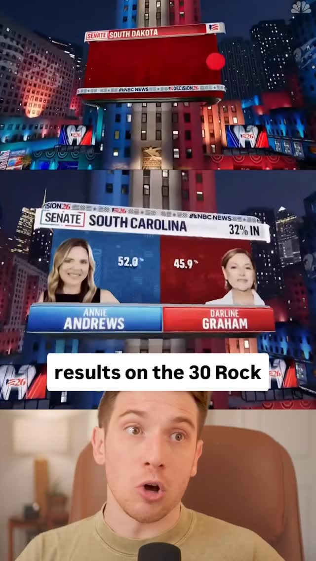
@ryanselvy Have we hit peak iPad Baby Maximalism? The broadcast graphics for election night last night were out of control. Across every network.
The front of the desks were covered in tickers, the maps were interactive on touch screens, there was augmented reality, transitions, motion graphics on motion graphics.
There was even stacks of information in the background that you were never even meant to be able to read. It was just visual motion texture.
It makes sense when you think about it. The public majority doesn’t watch cable television anymore. This is one of the few times when these news stations get insane amounts of viewership. And it’s important for their retention to stay up the whole time.
The problem is a lot of the information and reporting slowly trickles out over the period of many hours. But they have to find ways to keep it interesting and visually stimulating to keep you watching and keep it on.
Not to mention a lot of times, the broadcasts are cut down for social or they’re playing in a crowded place where the programming needs to be visually loud to stand out from the crowd. However, all of them are screaming at level 10 so everything just blends in together again.
Every square inch of the screen was moving, and I both loved it and I was also extremely overstimulated.
#motiondesign #broadcastgraphics #graphicdesign #motiongraphics
The creator delivers a sarcastic and critical analysis of the over-the-top, maximalist broadcast graphics used by news networks during election night coverage. He shows a rapid-fire montage of examples, including excessive tickers, countdown clocks, augmented reality maps, and touchscreen interactions, coining the term "iPad baby maximalism." He explains that these graphics are designed to keep viewers entertained when there is no new information, but concludes that the result is an overstimulating experience, even for someone who appreciates graphic design.
A visually chaotic split-screen of a news broadcast showing a panel of anchors, a large election results graphic, and multiple scrolling tickers on the desk.
[06]
Hook template
Steal this for your own video
Just make the [thing being overdone] like [exaggerated number] different [excessive element].
— Just make the menu like 40 different fonts.
— Just make the gym playlist like 15 different genres.
— Just make the wedding invitation like 12 different QR codes.
[07]
Hook and payoff
The promise the opener makes, and how the video pays it back
Hook
Begins with a sarcastic, hyperbolic command that introduces the subject of critique and establishes a comedic, critical tone.
Payoff
The narrator's personal admission of being overwhelmed serves as a relatable and satisfying conclusion, confirming the viewer's own potential feelings and solidifying the video's central thesis.
[08]
Narrative framework
The structural pattern this video runs on
Framework
The Expert Overload Critique
To critique an over-the-top trend by presenting a rapid-fire, escalating montage of examples, briefly explaining the rationale behind the trend, and concluding with a personal admission of being overwhelmed by it, thereby validating the critique.
1
The Evidence Gauntlet
Presents a rapid-fire sequence of increasingly extreme visual examples that prove the initial hyperbolic premise. Each example is accompanied by a short, critical, or sarcastic voiceover.
2
The Naming of the Absurdity
Coins a memorable, humorous phrase ('iPad baby maximalism') to label the phenomenon, making the abstract concept concrete and shareable.
3
The Rationalization Interlude
Briefly pauses the critique to offer a logical, strategic explanation for why the observed phenomenon exists, adding a layer of analytical depth beyond simple mockery.
4
The Final Validation
The narrator, positioned as an enthusiast or expert who should appreciate the phenomenon, admits to being negatively affected (overstimulated), serving as the ultimate confirmation and punchline for the entire critique.
Themes
Media Criticism
Information Overload
Design Trends
Sensationalism
Techniques
Montage
Sarcasm
Voiceover Commentary
Post caption
Have we hit peak iPad Baby Maximalism? The broadcast graphics for election night last night were out of control. Across every network.
The front of the desks were covered in tickers, the maps were interactive on touch screens, there was augmented reality, transitions, motion graphics on motion graphics.
There was even stacks of information in the background that you were never even meant to be able to read. It was just visual motion texture.
It makes sense when you think about it. The public majority doesn’t watch cable television anymore. This is one of the few times when these news stations get insane amounts of viewership. And it’s important for their retention to stay up the whole time.
The problem is a lot of the information and reporting slowly trickles out over the period of many hours. But they have to find ways to keep it interesting and visually stimulating to keep you watching and keep it on.
Not to mention a lot of times, the broadcasts are cut down for social or they’re playing in a crowded place where the programming needs to be visually loud to stand out from the crowd. However, all of them are screaming at level 10 so everything just blends in together again.
Every square inch of the screen was moving, and I both loved it and I was also extremely overstimulated.
#motiondesign #broadcastgraphics #graphicdesign #motiongraphics
Text overlays
informational · beginning
"Just make the desk"
informational · beginning
"like 20 different tickers"
informational · beginning
Let's put a menacing countdown clock on all the walls!
informational · beginning
Throw the election results on the 30 Rock building.
informational · middle
How about you animate the seats on the ice while you're at it?
informational · middle
What in the "iPad baby maximalism" did we just watch?
informational · middle
Not even talking about the finger painting touchscreens...
informational · middle
Make the floor a map
informational · middle
Wait, no, float the map with augmented reality
informational · end
All of it's designed to keep you entertained
informational · end
If you isolate any square inch of the screen, something is moving at any given moment.
Transcript
Best make the yes, like, 20 different tickers. Let's put a menacing countdown clock on all the walls and on the desks. Throw the election results on the 30 Rank Building. How about you animate the seats on the ice while you're at it? I don't know. Can we do something with text messages? What in the iPad baby maximalism did we we just watch? Not even talking about the finger painting touch screens. What is going on back here? Make the floor map. Wait. No. Float the map with augmented reality. All of it's designed to keep you entertained during the hours when there's no new information. You gotta be sure to label the official... No official official results. If you isolate any square inch of the screen, something is moving at any given moment. You follow my channel. You know I love these graphics. But, like, what does it mean if even I'm overstimulated?