@jessicatatedesign
TikTok · Yap

@jessicatatedesign there is only one exception to designing at 1920x1080. everything else should be less than that. #design #website #uidesign #webdesign

@jessicatatedesign
TikTok · Yap
@jessicatatedesign there is only one exception to designing at 1920x1080. everything else should be less than that. #design #website #uidesign #webdesign
Performance
Video #5094 · Yap
[01]
The creator debunks the common web design practice of using a 1920x1080 resolution. She explains that while this is a common monitor size, it doesn't reflect the actual browser viewport size, as most users don't browse in full-screen. She argues that this assumption leads to designs that are too wide and concludes by warning designers against this mistake, noting e-commerce sites as a potential exception.
[02]
[03]
 61.9KComparing desktop vs mobile design@pixeldesignlab · Breakdown
 54K1.1×Explaining a website design transformation@pixeldesignlab · Before/After Transformation
 698.5K8.5×Web designer debunks common misconception@marcelodesignx · Hot Take
 194.8K2.2×Redesigning a website for scannability@pixeldesignlab · Tutorial / How To
 495.3K20.4×Contrasting bad vs good web design@marcelodesignx · Good vs Bad
 130.1K1.7×Website redesign before and after@pixeldesignlab · Good vs Bad
 274.1K1.1×Fixing common website design mistakes@pixeldesignlab · Before/After Transformation
 59.5KExplaining familiar website design principles@pixeldesignlab · Hot Take
 97.4K2.1×Web design process start to finish@pixeldesignlab · Tutorial / How To
 580.6K2.6×Creator breaks down web design trends@deathtostock · Breakdown
 494.4K2×Before and after website redesign@pixeldesignlab · Before/After Transformation
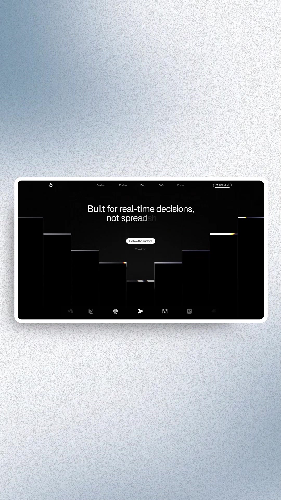 5M1601.7×Hook to visual design montage@marcelodesignx · Inspo Lookbook
[04]
[05]
What stops the scroll in the first 3 seconds
Title hook · 65%
why designing websites at 1920x1080 is a huge mistake
Verbal hook · 30%
There is a lie and a myth that we need to break right tier, right now as designers.
Visual hook · 5%
A medium close-up of the speaker wearing a bright red hat that contrasts with the neutral background, looking directly into the camera to establish an immediate connection.
[06]
Steal this for your own video
Why is a huge mistake for
[07]
The promise the opener makes, and how the video pays it back
Hook
A bold, contrarian statement that directly challenges a common practice or belief within a specific community, creating an immediate knowledge gap.
Payoff
Deliver a new, corrected rule of thumb or a clear warning against the old way of thinking, often with a nuanced exception to demonstrate comprehensive expertise and provide a clear, actionable takeaway.
[08]
The structural pattern this video runs on
Framework
The Common Mistake Reframe
To debunk a widely held belief within a niche by revealing a subtle but critical flaw in the common understanding, thereby establishing authority and providing actionable value.
The Audience Validation
Acknowledge the popular belief and the seemingly logical data or reasoning that supports it. This builds rapport and shows understanding of the audience's perspective before challenging it.
The Subtle Pivot
Introduce a 'but' or 'however' to signal that the common understanding is incomplete or flawed. This creates suspense and prepares the viewer for the new information.
The Core Reframe
Explain the critical piece of missing information or the subtle distinction that changes the entire interpretation of the common belief. This is the 'aha' moment where the myth is busted.
The Relatability Proof
Ground the abstract argument in a simple, self-evident observation or personal test that the viewer can perform on themselves, making the new logic feel intuitive and personally verifiable.
there is only one exception to designing at 1920x1080. everything else should be less than that. #design #website #uidesign #webdesign
title · beginning
why designing websites at 1920x1080 is a huge mistake
There is a lie and a myth that we need to break right tier, right now as designers. I recently posted a video talking about what design should or what width should I be using for my designs. And a lot of you are saying nineteen twenty by ten eighty is the most common size that people are viewing websites on. Well, this is true from analytics. This is actually not entirely correct. This is a myth. Nineteen twenty by ten eighty is the most common HD desktop monitor size. Right? So that makes sense. However, this desktop monitor size. Right? So that makes sense. However, this assumes that someone is opening tier website full width on their laptop. We don't actually have the ability without doing, like, custom code to see what is the most common view within the nineteen twenty by common view within the nineteen twenty by ten eighty. So all we have access to is the device itself, the screen resolution. I almost guarantee that if you observe worse, like, using the Internet, that you are not actually using your browser at full width. You are probably like, I'm looking at my computer right now over tier. It's probably like yes than that. So be really careful with the assumption that nineteen twenty by ten eighty is the correct size. In fact, I would argue that it's probably way too big and that most people aren't actually viewing their site at full width, with maybe the exception of ecommerce. I do feel like sometimes when you're shopping, you like to be full width because you can see more products at once. But, like, the average website, probably not.