@pixeldesignlab
TikTok · Split screen

@pixeldesignlab Replying to @Erin | NYC Photographer Here’s mobile version of the website, btw did you know that Google ranks your website based on your mobile view? 🧐

@pixeldesignlab
TikTok · Split screen
@pixeldesignlab Replying to @Erin | NYC Photographer Here’s mobile version of the website, btw did you know that Google ranks your website based on your mobile view? 🧐
Performance
Video #5391 · Split screen
[01]
The creator responds to a user's question about mobile website design by visually comparing a desktop layout to its mobile counterpart. She explains that desktop's wider space allows for complex, multi-column layouts, while mobile design must stack elements vertically in a single column to ensure readability and easy navigation. She concludes by emphasizing the importance of a mobile-optimized site for improving Google search rankings.
[02]
[03]
 51.6K13.1×Explaining a common web design mistake@jessicatatedesign · Hot Take
 194.8K2.2×Redesigning a website for scannability@pixeldesignlab · Tutorial / How To
 54K1.1×Explaining a website design transformation@pixeldesignlab · Before/After Transformation
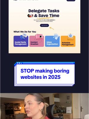 130.1K1.7×Website redesign before and after@pixeldesignlab · Good vs Bad
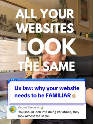 59.5KExplaining familiar website design principles@pixeldesignlab · Hot Take
 216.9K1.3×Analyzing a web design trend@joshfromyolkk · Breakdown
 580.6K2.6×Creator breaks down web design trends@deathtostock · Breakdown
 274.1K1.1×Fixing common website design mistakes@pixeldesignlab · Before/After Transformation
 698.5K8.5×Web designer debunks common misconception@marcelodesignx · Hot Take
 52.7KExplaining website redesign process@pixeldesignlab · Before/After Transformation
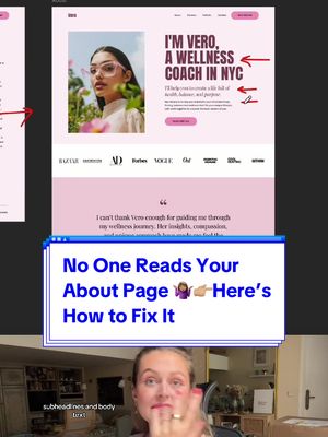 494.4K2×Before and after website redesign@pixeldesignlab · Before/After Transformation
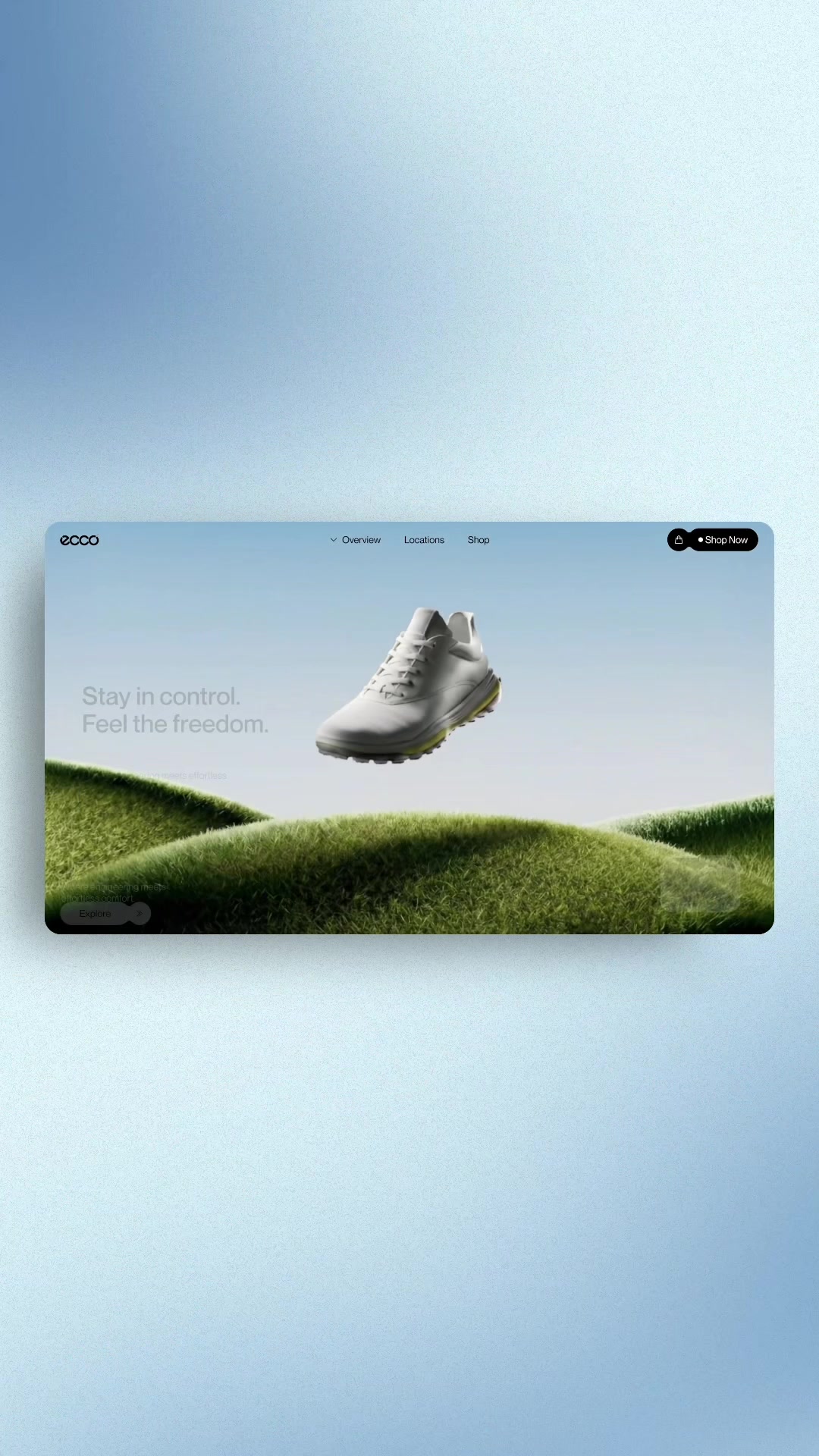 495.3K20.4×Contrasting bad vs good web design@marcelodesignx · Good vs Bad
[04]
[05]
What stops the scroll in the first 3 seconds
Title hook · 50%
Your Website Looks Great on Desktop, But What About Mobile?
Verbal hook · 25%
this website looks good on the computer but what about the mobile view?
Visual hook · 25%
A split-screen style layout showing a vibrant pink website design on the left and a placeholder for the mobile view on the right, immediately establishing a visual comparison.
[07]
The promise the opener makes, and how the video pays it back
Hook
Directly state or show a common question from the audience to establish immediate relevance and create an open loop that the video promises to close.
Payoff
The Critical Consequence: Conclude by revealing a powerful, external reason why mastering this adaptation is crucial. This ties the lesson to a larger, high-stakes goal like search engine ranking, business success, or avoiding failure, making the entire explanation feel indispensable.
[08]
The structural pattern this video runs on
Framework
The Expert Explainer Framework
Answering a common user question by comparing an ideal, expansive scenario with a constrained, simplified one, and concluding with a high-stakes reason why the distinction is critical.
The Ideal State Breakdown
Describe the first scenario (e.g., desktop), highlighting its advantages, flexibility, and possibilities. This establishes a baseline of what's possible without constraints, using visuals to demonstrate the expansive layout.
The Constrained Reality Solution
Introduce the second, more limited scenario (e.g., mobile). Explain and visually demonstrate how the elements from the ideal state must be adapted, simplified, or re-stacked to fit the new constraints.
The Guiding Principle
Justify the adaptations by explaining the core rule that governs the constrained design (e.g., user experience, readability, ease of navigation). This adds an authoritative 'why' to the 'how'.
The Hierarchy Mandate
Reveal a specific, non-obvious strategic choice made during the adaptation process, explaining how content or elements are prioritized to maximize impact in the constrained format.
Replying to @Erin | NYC Photographer Here’s mobile version of the website, btw did you know that Google ranks your website based on your mobile view? 🧐
title · beginning
DESKTOP
title · beginning
MOBILE?
title · beginning
Your Website Looks Great on Desktop, But What About Mobile?
contextual · beginning
Is this desktop layout only? How would it translate to mobile?
title · end
MOBILE
Website looks good on the computer, but what about the mobile view? So many of you are asking. Let me show you. On the desktop view, we have obviously the advantage of wider space that allows us to display multiple columns of text, images, videos side by side simultaneously. Elements can be spaced out more, and there is more room for complex layouts. On the other hand, when we were designing for smaller screens, the design is more compact, and the elements are stacked vertically to fit in with this smaller space. Basically, it's less fun and less flexible because we need to use usually the single column layout to ensure good readability and also ease of navigation. And the most important content is always placed at the top. We prioritize it. So for example tier, this text is more important than my picture. The same thing here. And remember, never underestimate the mobile view of your website because search engines like Google prioritize mobile optimized website, and your ranking on Google depends on the mobile view.