Viral Hooks
Trending short videosExplaining familiar website design principles
P

@pixeldesignlab

TikTok · Speaker address

@pixeldesignlab Your website shouldn’t be boring but it doesn’t mean, it’s not based on data and it doesn’t have to meet user expectations ☝🏼 P.S.: sorry for all my dog’s hair on my t-shirt, I didn’t see it 😂 #uxdesign #uxdesigner #uxdesigntips #webdesign #webdesigner #webdesigntips

View original on TikTok

The edit1 shot · 8 text
Shots Text0:56

Performance

Views
59.5K
Likes
4.7K
Comments
84
Engagement
8.1%
Length · 30 Jan 2025
0:56

Video #5350 · Speaker address

Explaining familiar website design principlesfrom @pixeldesignlab

[01]

Overview

The creator addresses negative comments about her websites looking similar by explaining the UX principle of Jacob's Law. She argues that websites should have familiar structures to be user-friendly and effective at converting visitors, while clarifying that personality can still be added through branding, colors, and content.

[02]

Simple outline

  1. 1Acknowledge common criticism
  2. 2Reframe the core problem
  3. 3Introduce guiding principle
  4. 4Provide nuanced solution
  5. 5State ultimate business goal

[03]

Related videos

[04]

Classification

Concepts
Hot TakeBreakdown
Elements
On-screen comment hookText OverlayMontage Editing

[05]

Hook analysis

What stops the scroll in the first 3 seconds

Title hook · 35%

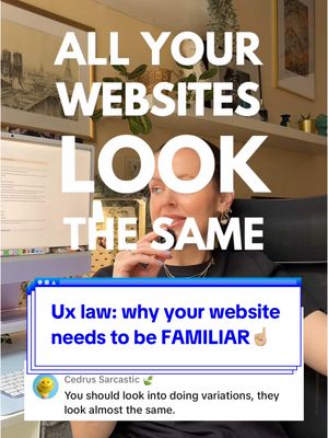
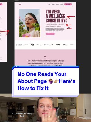
ALL YOUR WEBSITES

Verbal hook · 30%

All your websites look the same.

Visual hook · 35%

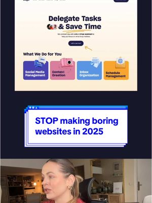
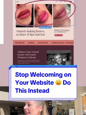
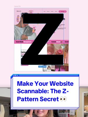
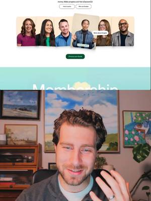
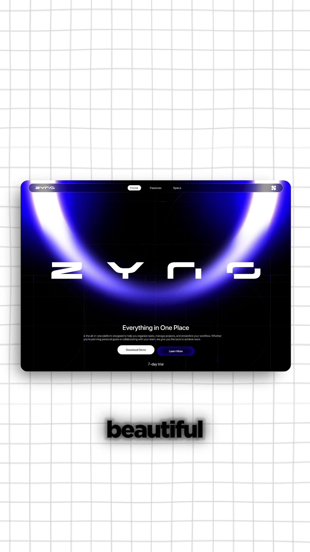
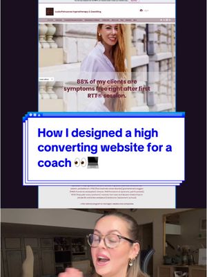
The video opens with a direct-to-camera shot, immediately followed by a rapid montage of website screenshots and user comment overlays, creating fast-paced visual movement and social context.

[06]

Hook template

Steal this for your own video

ALL YOUR [WORK PRODUCT] LOOK THE SAME

  • — ALL YOUR RESUMES LOOK THE SAME
  • — ALL YOUR AD CREATIVES LOOK THE SAME
  • — ALL YOUR MEAL PREPS LOOK THE SAME

[07]

Hook and payoff

The promise the opener makes, and how the video pays it back

Hook

The creator directly quotes common negative feedback or criticism about their work, then expresses surprising agreement with it to create immediate intrigue and subvert viewer expectations.

Payoff

Delivers the final, actionable takeaway that reframes the ultimate goal from a superficial one (e.g., winning awards) to a practical, results-oriented one (e.g., converting clients), providing a clear and memorable conclusion.

[08]

Narrative framework

The structural pattern this video runs on

Framework

The Contrarian Reframe

The creator addresses a common criticism by surprisingly agreeing with it, then uses this as a hook to reframe the audience's understanding of the topic's fundamental purpose, ultimately providing a nuanced solution that reconciles the initial conflict.

  1. 1

    The Counterintuitive Thesis

    States a bold, paradoxical claim that requires justification, compelling the viewer to stay for the explanation (e.g., 'That's exactly what we want').

  2. 2

    The Foundational Reframe

    Redefines the subject's core purpose using a simple analogy (e.g., 'It's not an art gallery, it's a tool'), establishing a new framework for evaluation.

  3. 3

    The Relatability Test

    Poses a rhetorical question based on a common user experience to make the viewer personally validate the creator's argument, shifting from abstract theory to lived experience.

  4. 4

    The Authoritative Principle

    Names a formal law, theory, or principle to lend credibility and authority to the argument, elevating it from personal opinion to established knowledge.

  5. 5

    The Nuanced Solution

    Proactively addresses the most obvious counter-argument (e.g., 'Does this mean it has to be boring?') and provides a list of specific ways to reconcile the two opposing ideas, demonstrating expertise.

Themes

  • User experience
  • Conversion optimization
  • Design principles
  • Psychology in design

Techniques

  • Direct address
  • Social proof
  • Principle explanation

Trends

  • Replying to comments
  • Educational content

Post caption

Your website shouldn’t be boring but it doesn’t mean, it’s not based on data and it doesn’t have to meet user expectations ☝🏼 P.S.: sorry for all my dog’s hair on my t-shirt, I didn’t see it 😂 #uxdesign #uxdesigner #uxdesigntips #webdesign #webdesigner #webdesigntips

Text overlays

  • title · beginning

    ALL YOUR WEBSITES

  • contextual · beginning

    Cedrus Sarcastic You should look into doing variations, they look almost the same.

  • contextual · beginning

    Sabina | Wedding Photographer What is I've already seen these types and do not want my website to look like this... super boring for me

  • informational · beginning

    GREAT

  • informational · middle

    WOW

  • informational · end

    BRAND COLORS layouts INTERACTIONS animations CONTENT

  • informational · end

    KEEP IT FAMILIAR

  • informational · end

    is to convert visitors into clients

Transcript

All your websites look the same. You should look into variations, the same layout. I've seen these types of websites everywhere. Great. That's exactly what we want. Let me explain. Your website isn't an art gallery. It's a tool. And just like any other tool, people need to know how to use it instantly. Just think about it. When was the last time you landed on the website and you thought, wow, this is so unique. I have no idea where to click or what to do, and you've actually stayed there. This is called Jacob's law. People spend most of their times on other worse, which means they expect your website to work exactly the same way as all the other websites they already know. Does this mean your website needs to be boring? Not at all. We can still add personality through brand colors, layouts, micro interactions, subtle animations, your unique content. But the core navigation and structure? Keep it familiar. Because your website's job isn't to win design awards, it's to convert visitors into clients.